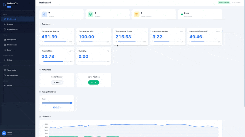
Dashboard
The Dashboard is your primary control centre. It shows live sensor readings, lets you toggle actuators, adjust range controls, and displays a real-time chart — all updating in real time.
At a Glance
When you open the Dashboard you see four sections:
| Section | What It Shows |
|---|---|
| Stats bar | Total sensor count, actuator count, range control count, and connection status |
| Sensor cards | One card per sensor with current value, unit, and min/max range indicator |
| Actuator controls | ON / OFF toggle for each actuator |
| Range controls | Adjustable slider for each range-type event |
| Live chart | Scrolling line chart with the last 60 readings per sensor |
Connection Status
The stats bar shows how data is being received:
| Indicator | Mode | Meaning |
|---|---|---|
| Live (green) | WebSocket | Data streams in real time — best experience |
| Poll (amber) | HTTP Polling | WebSocket unavailable, polling every 1.5 s |
| Connecting | — | Establishing connection |
Connection tips
- Live mode is the default and recommended. Data appears instantly.
- If you see Poll mode, check that the backend WebSocket endpoint is reachable. The system switches to polling automatically after 3 failed WebSocket reconnection attempts.
How Automatic Fallback Works
flowchart TD
    A[Dashboard opens] --> B{WebSocket connects?}
    B -->|Yes| C[Live mode — stream data]
    B -->|No| D{Retry count < 3?}
    D -->|Yes| B
    D -->|No| E[Switch to HTTP polling]
    C -->|Connection drops| D
    E --> F[Poll GET /api/v1/datapoints/latest every 1.5 s]
Sensor Cards
Each sensor event gets its own card displaying:
- Name — the sensor label (e.g. "Inlet Temperature")
- Current value — large, easy-to-read number
- Unit — measurement unit (°C, bar, L/min, …)
- Range bar — visual min/max indicator showing where the current value falls
Values update automatically whenever new data arrives via the real-time connection.
Actuator Controls
Each actuator event is shown as an ON / OFF toggle button. Toggling sends a datapoint with value 1 (ON) or 0 (OFF) to the backend, which the IoT controller picks up to switch hardware outputs.
Actuators affect physical hardware
Toggling an actuator immediately sends a command to the controller. Make sure the connected equipment is in a safe state before switching.
Range Controls
Range events appear as sliders bounded by the event's min_value and max_value. Dragging the slider sends the selected value as a new datapoint.
Use range controls for setpoints like target temperatures, flow rates, or motor speeds.
Live Chart
The bottom section shows a scrolling line chart powered by Chart.js:
- One line per sensor — up to 8 colours are cycled automatically
- Last 60 data points per sensor
- Smooth curves — filled area under each line for easy visual separation
- Auto-scrolling — oldest data drops off the left edge as new data arrives
The chart updates every time a new datapoint batch is received.
Chart visibility
The live chart section only appears when at least one sensor event exists.
Typical Workflow
- Create events — go to Events & Sensors and define your sensors, actuators, and range controls
- Start the controller — the IoT controller reads hardware and pushes datapoints to the backend
- Open the Dashboard — sensor cards fill with live values, the chart starts plotting
- Interact — toggle actuators, adjust range sliders, monitor trends
- (Optional) Start an experiment — go to Experiments to begin grouping datapoints
Configuration Reference
| Setting | Where | Default | Description |
|---|---|---|---|
| Poll interval | Frontend composable | 1.5 s | Time between HTTP polls in fallback mode |
| WS heartbeat | Backend config | 30 s | Server-side ping to keep WebSocket alive |
| Max WS retries | Frontend composable | 3 | Reconnection attempts before switching to polling |
Custom Dashboards
Build your own monitoring view
The system dashboard above shows everything at once. Custom dashboards let you build purpose-built views with only the widgets you need — one for the reactor, one for the cooling loop, one for the client demo.
Creating a Dashboard
- Navigate to Dashboards in the sidebar
- Click New Dashboard
- Enter a name (e.g., "Reactor Zone A")
- Optionally check "Visible to all users" to make it a global dashboard
- Click Create
Visibility
Each user sees their own dashboards plus any dashboard marked as global. Only the dashboard owner can edit or delete it.
Widget Types
Click Add Widget to choose from four types:
| Widget | Type | Purpose | Refresh Rate |
|---|---|---|---|
| Line Chart | line_chart |
Time-series trend with labelled X-axis (timestamps) and Y-axis (unit from linked event, e.g. °C, bar, %) | 5 seconds |
| Gauge | gauge |
Radial meter with colour coding (green/yellow/red), unit label, and min/max scale from the linked event | 3 seconds |
| Stat Card | stat_card |
Large current value with label and unit from the linked event | 3 seconds |
| Actuator Toggle | actuator_toggle |
ON/OFF button for valves, relays, motors | 3 seconds |
Each widget connects to a sensor event and refreshes automatically via HTTP polling at the rate shown above.
Size Presets
When adding a widget, pick a size:
| Preset | Columns | Rows | Good For |
|---|---|---|---|
| Small | 3 | 2 | Stat cards, toggles |
| Medium | 4 | 3 | Gauges |
| Wide | 6 | 3 | Charts with moderate detail |
| Large | 6 | 4 | Primary charts |
| Full Width | 12 | 4 | Full-width trend lines |
The dashboard uses a 12-column CSS grid with 80 px row height. Widgets flow automatically into available space.
Grid Layout Example
┌──────────────┬──────────────┬──────────────┐
│  Stat Card   │  Stat Card   │    Gauge     │
│  (3 col)     │  (3 col)     │   (3 col)   │
├──────────────┴──────────────┼──────────────┤
│         Line Chart          │   Actuator   │
│         (6 col, 2 rows)     │   Toggle     │
│                             │   (3 col)    │
└─────────────────────────────┴──────────────┘
Edit & Lock Mode
- Click Edit to reveal pencil and trash icons on each widget
- Click Lock to hide edit controls and prevent accidental changes
- Widgets can be edited (change title, data source, size) or deleted with a two-step confirmation
Time Range Selector
Each custom dashboard has a time range selector with six presets:
| Preset | Minutes | Typical Use |
|---|---|---|
| 20 min | 20 | Live troubleshooting |
| 1 hour | 60 | Short experiment |
| 6 hours | 360 | Half-shift monitoring |
| 24 hours | 1440 | Daily overview |
| 7 days | 10080 | Weekly trends |
| 10 days | 14400 | Extended campaign |
The selected range is remembered per dashboard in your browser and synced to
the URL (?range=60), so you can bookmark a specific view.
Managing via API
# Create a dashboard
curl -X POST http://localhost:8000/api/v1/dashboards \
  -H "Authorization: Bearer $TOKEN" \
  -H "Content-Type: application/json" \
  -d '{"name": "Reactor Overview", "is_global": false}'

# Add a line chart widget
curl -X POST http://localhost:8000/api/v1/dashboards/$DASH_ID/widgets \
  -H "Authorization: Bearer $TOKEN" \
  -H "Content-Type: application/json" \
  -d '{
    "widget_type": "line_chart",
    "title": "Inlet Temperature",
    "event_public_id": "evt_abc123",
    "x": 0, "y": 0, "w": 6, "h": 3
  }'

# List all dashboards
curl http://localhost:8000/api/v1/dashboards \
  -H "Authorization: Bearer $TOKEN"
Example: Reactor Monitoring Dashboard
- Create dashboard "Reactor Zone A"
- Add a
stat_card(Small) → "Inlet Temp" sensor - Add a
stat_card(Small) → "Outlet Temp" sensor - Add a
gauge(Medium) → "Pressure" sensor - Add an
actuator_toggle(Small) → "Emergency Valve" - Add a
line_chart(Full Width) → "Inlet Temp" sensor
Result: A single-screen view with live values, a safety gauge, an emergency control, and a trend line — all updating automatically every few seconds.
Next Steps
- Integrations & Extensibility — connect WebMACS to Slack, Node-RED, and more
- Events & Sensors — define what data feeds the dashboard
- Experiments — start grouping data into experiments
- Automation Rules — get alerted when values cross thresholds